Top 10 Web App Development Trends in 2022
Web apps will only continue to increase in popularity over the next year. Businesses and consumers are using the web to communicate and make decisions more than ever. And they expect speed, reliability, and security.
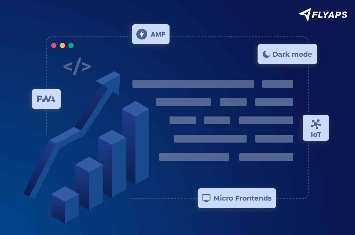
Several trends have been around for years, and are currently accelerating in popularity. These include:
- Progressive Web Apps
- Single-Page Applications
- Dark Mode
- Accessibility
- Internet of Things
- Mobile-first Development
- API-first Development
- Browser extensions
- Micro Frontends
- Accelerated Mobile Pages
By adopting these technologies, you can take advantage of the latest in web app development.
Progressive Web Apps
Installing an app on your smartphone may be easy, but it still takes a few steps. Many users prefer to visit a website than to go to the app store, search for an app, and then download. This friction slows the adoption of new apps by quite a bit.
Progressive web apps (PWAs) solve this problem. Instead of navigating to the app store, users can get a PWA directly from a website. Developers simply publish the app online and make sure that it meets certain installability criteria.
Companies that already offer PWAs include:
- Starbucks
- Uber
- Lyft
PWAs offer several advantages over traditional apps. They are often smaller and easier to install. They can work in many settings, like Uber’s 2G-friendly app. And they offer security advantages as well.
Many users prefer to download PWAs and use them more often. Their small size makes them good for older devices. Users with older devices download the Lyft PWA 40% more often than the regular app, and used it to take 11% more rides. Also, Starbucks’ PWA has increased daily usage twofold.
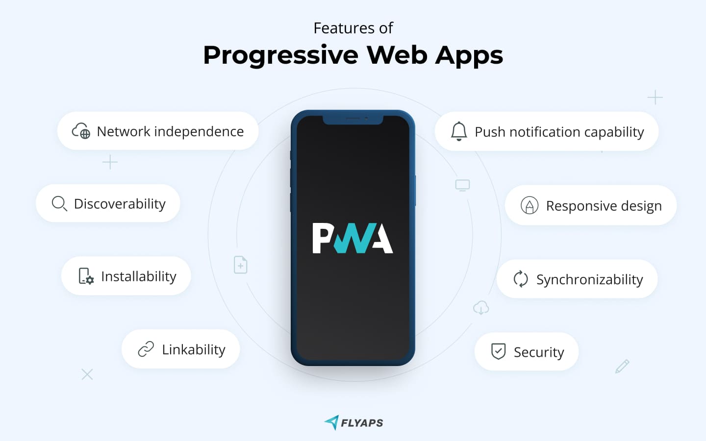
PWAs are made with many different technologies. Any web app can be called a “Progressive Web App” so long as it is made according to a certain philosophy.
This entails several general features, including:
- network independence
- installability
- discoverability (search-engine friendly)
- linkability
- security
- responsive design
- synchronizability
- push notification capability
To assess how “progressive” your web app is, Google offers an open-source, automated tool called Lighthouse.
Starbucks’ PWA
Let’s take a quick look at Starbucks’ app.
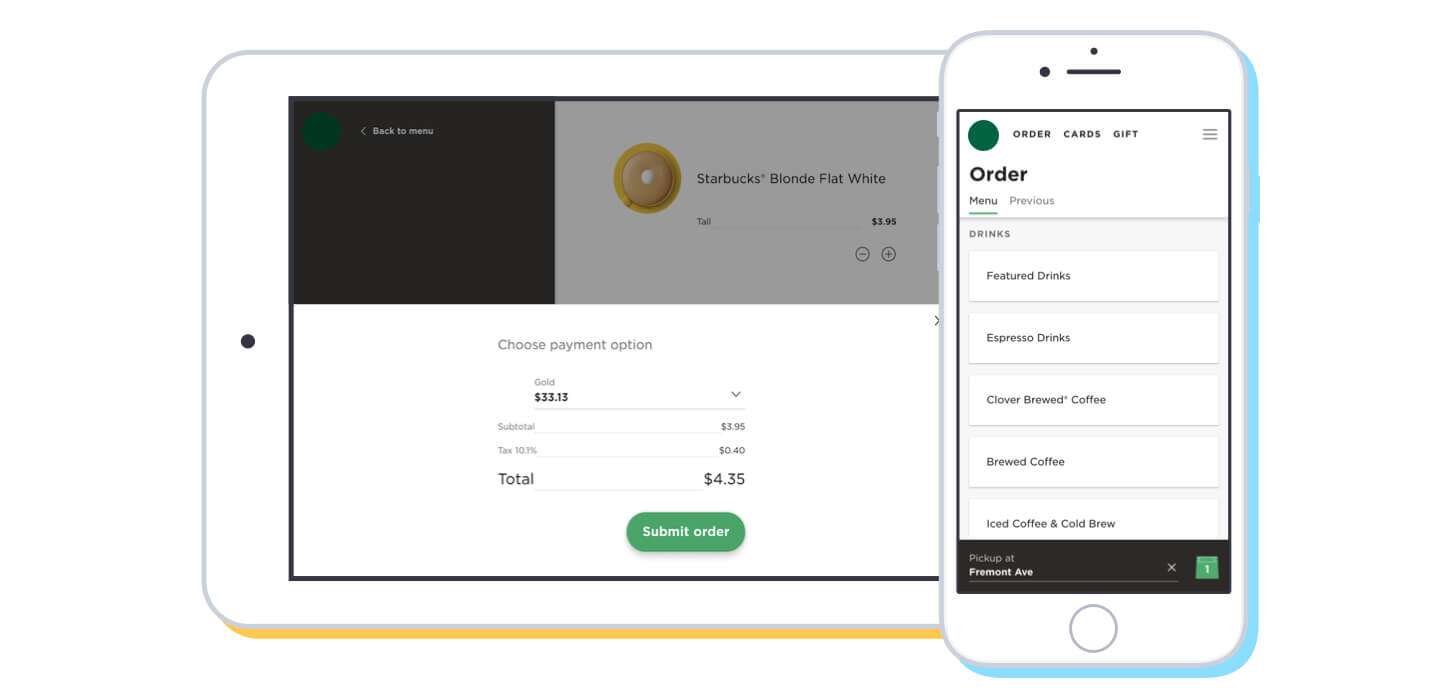
The app was developed with both established and emerging markets in mind. It has functionality both online and off, allowing one to browse drinks and place orders in the cart with or without internet. This helps with emerging markets, where internet access may not always be consistent.
Once connected, however, you can use the app to see prices, find local stores, and place orders. Customers can customize their order to their liking, sign up for a membership, and receive rewards.
Single-Page Applications
Single-page applications are Javascript-based web apps that dynamically load content. This means they don’t need a browser to refresh the page.
Instead of updating the whole thing at once, single-page applications update newly changed content. Things like headers and footers stay the same while data fields and information boxes change.
Commonly made with systems like AngularJS, React, and Vue single-page applications are lightweight, cost-effective, and easy to develop. They minimize the amount of information a server has to hold and send. Because of this, they will likely continue to grow in significance over time.
Popular single-page applications include:
- Gmail
- Google Maps
One problem that single-page applications face is a difficult time with SEO. Because the page is not static, it doesn’t have stable content for a search engine to recognize. Recognizing this, Google now enables its algorithm to crawl CSS and JavaScript files. However, this is not as reliable for SEO as static pages are.
Dark Mode
Staring at a computer screen for long periods of time can hurt your eyes. The bright, blue light creates eyestrain and headaches. This can worsen at nighttime as the mismatch between the screen light and the darkness outside increases.
Lots of businesses have begun offering dark mode versions of their products in recent years. Mac OS X now has it, as so do Facebook and Twitter. It is becoming standard to allow users to switch between light and dark modes in accordance with their system preferences.
Dark mode is popular. Over 90% of the population uses it. Not many other technologies receive such strong support. However, it is not a perfect solution to the problem of eyestrain. The text may look washed out, making it difficult to read easily. And reading in dark mode in a light, sunny room can be difficult.
Dark mode is also nothing new. In fact, it is arguably the oldest trend on our list. Computers in the 70’s and 80’s were “dark mode” by default, to save energy. But with the rise of personal computers by the end of the 20th century, software developers were making programs lighter to resemble traditional paper-based office environments. Today, however, people are so used to working with computers that this is no longer the case. Many prioritize their health instead.
Many platforms offer built-in dark mode integration. CSS, Javascript and React support it with just a few added lines of code.
Accessibility
People of every kind of ability status use the internet. Developers should be mindful to do what they can to make apps accessible to people with visual impairments, auditory impairments, limited range of motion, and epilepsy.
To this end, developers can follow the A11y checklist. A11y (a play on “ally”) is an organization that seeks to make digital accessibility easier. They offer an accessibility checklist that developers can use to make sure their work is accessible. Some requirements include:
- Making sure that the media does not autoplay.
- Removing seizure triggers from video.
- Adding subtitles.
- Using only one H1 element per page.
- Making sure that all img elements have an alt attribute.
Using this checklist will not guarantee that your site is accessible to everyone. However, it will make your site easier to use for everybody.
Other useful tools include Easy Checks, another accessibility checklist, and Wave, a FireFox add-on that assesses the accessibility of a web page.
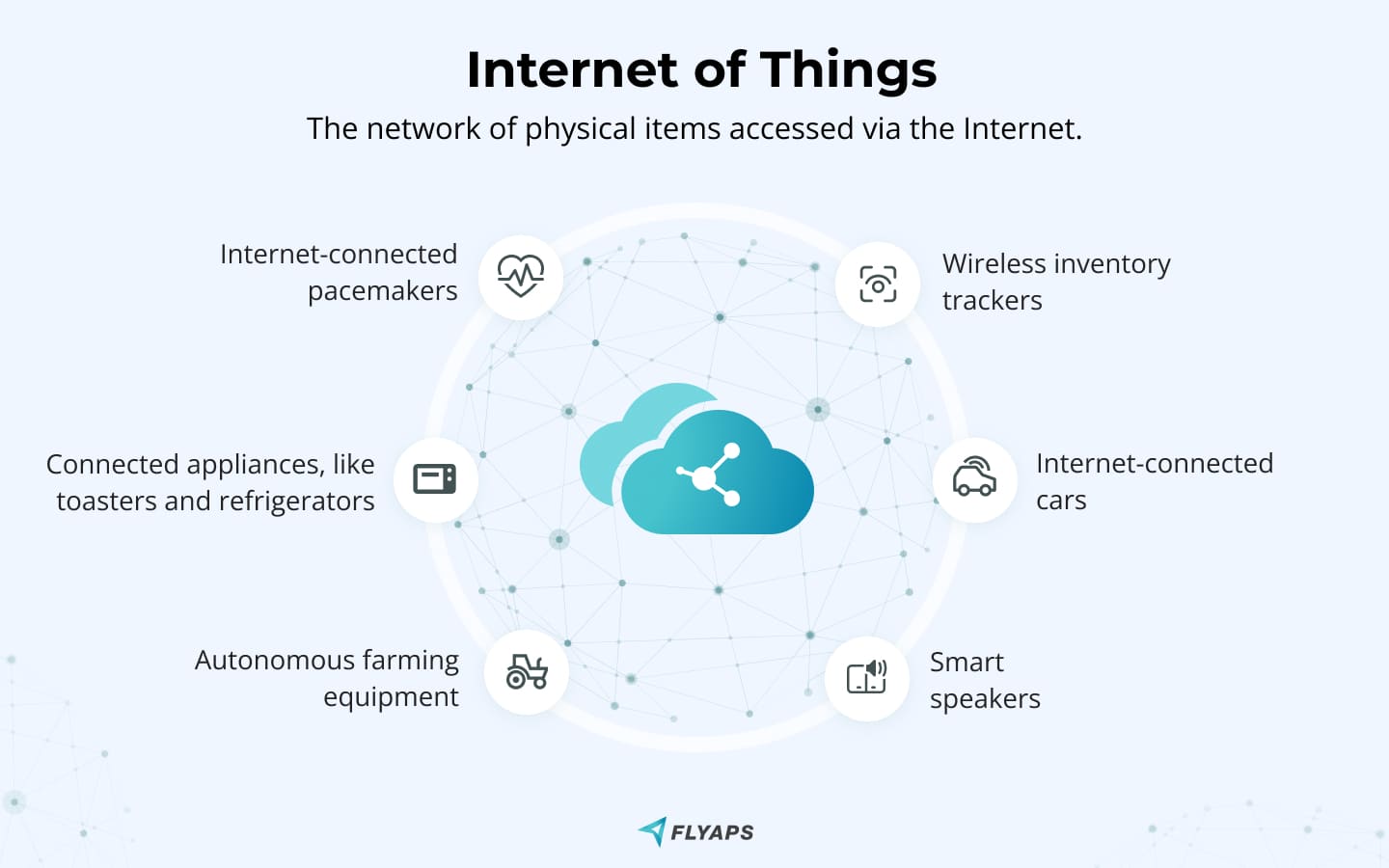
Internet of Things
The Internet of Things (IoT) refers to physical objects that are embedded with software, sensors, computer technology, and a way to connect to the internet.
This wide class of objects includes:
- internet-connected pacemakers
- connected appliances, like toasters and refrigerators
- autonomous farming equipment
- wireless inventory trackers
- internet-connected cars
- smart speakers
There is no end to the potential of the Internet of Things. Anything you can think of can be connected to the internet. And everything connected to the internet needs a way to interface with human beings.
That’s where web apps come into play. Say your bodyweight scale connects to the internet. One way to access its information is to use a web app. This app could potentially connect to other services, like spreadsheets or fitness tracking tools.
IoT-connected web apps need to process a high volume of data. They need to be reliable, fast, and easy to connect. Web developers specializing in IoT will need to think carefully about how to best design web apps for their services.
The demand for IoT web apps will only increase with the demand for IoT products. By 2023, McKinsey expects 43 billion IoT connected devices. That means a lot of web apps, too!
Many platforms support IoT technology. These include Google Clout IoT, Amazon AWS IoT, and Microsoft Azure IoT.
Mobile-first development
Over half of all worldwide traffic comes from mobile phones. Almost 75% of all e-commerce sales are done on a smartphone. With that much traffic, it often makes sense to think of development from the mobile user's perspective first.
Mobile-first development constantly changes because smartphones constantly change. While consumers are most familiar with touchscreen rectangle phones, products like Samsung’s Galaxy Flip offer significant hardware differences.
In any case, developers need to consider the smaller screen of mobile vs desktop, and how this impacts the appropriate size of features. Mobile users prefer simple, unobstructed web apps with large icons and readable text.
Other modern mobile-first development practices include:
- using geolocation data to personalize user experience
- one-click ordering
- biometric authentication, like fingerprint or face activation
Once the mobile experience is designed, you can start thinking about the desktop experience. The desktop app may have smaller icons, more text, and larger headers and footers.
Savvy developers may also consider making sure their mobile pages work well on tablets, too. Although tablet computers are made with mobile applications in mind, their larger screen size can introduce rendering problems.
API-first development
API stands for Application Programming Interface. It’s a connection between two applications that permits them to talk to each other.
Taking an API-first approach means making your APIs the focus of your efforts. The assumption is that mobile devices will use the end product, and client applications will use the APIs. APIs will be made consistent, reusable, and well-thought-out to make them easy to use for multiple contexts.
The advantage of this approach is scalability and flexibility. Applications that use your APIs can rely on them for many different functions. This helps ensure a good user experience across devices and platforms.
API-first development also helps to:
- reduce costs
- speed up time to market
- enable parallel development
Because APIs are reusable, they don’t have to be developed twice. This saves costs over time. And it reduces production time because new technologies can be added without redesigning the whole system.
Developers can work in parallel without even needing the full APIs to be updated. So long as the APIs are documented with consistent definitions, development teams can work with them.
Browser extensions
A browser extension, often known as an add-on, is a web application that works in a browser with the goal to widen its functionality.
Many vendors create such apps to complement their services, for example Lastpass, which is a password manager that stores your passwords and allows you to access them from every computer and mobile device.

In 1999, Internet Explorer became the first major browser to enable extensions. So, add-ons are pretty old types of web applications, however their popularity is increasing year after year.
Browser extensions are generally written in programming languages like JavaScript, HTML, and CSS. JS frameworks could be used as well (e. g. React). In some rare cases, other languages like C++, .NET could be utilized although this is becoming less common.
Due to differing browser APIs, Chrome extension code would not work in Firefox, so developers should remember to implement each code for a specific browser. Although here are some great news: World Wide Web Consortium (W3C) is working on making a uniform API for browser extensions. Soon it would be possible to have one code base for different browsers!
Micro frontends
It is common to build a single frontend on top of evolving microservice architecture. Over time, as the backend develops, the frontend becomes more complex and hard to deal with.
Instead of growing one big, unwieldy frontend, you can build many modular frontend components and put them together. Each part can be worked on separately and connected with its own pieces of the back end.
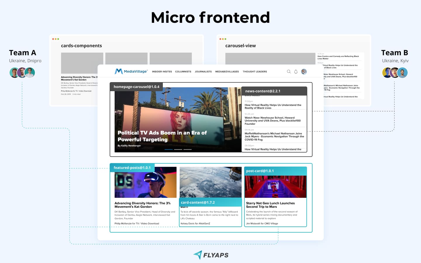
Like API-first development, this practice helps enable parallel development. It makes development a more flexible process and can speed up release cycles. Indeed, the whole app need not be updated at once. Each piece of the frontend can be released on its own schedule, so long as all components are properly coordinated.
Capital One Case Study
Capital One, a credit card company, developed a micro frontend solution for their call center. They had developed a massive call center system in the late 00’s, based on existing technology. But over time, that tech became too inflexible to support their 20,000 call center technicians.
New builds on the old system could take a full day, with the help of many system administrators. Testing could take several days. And large changes went into effect all at once, making it hard to manage mistakes.
The new, micro frontend-based system changed all of this. Now, developers can have anytime releases of new software. The modular system allows them to piece together a whole application out of smaller parts. This means that a mistake in one component can be removed and addressed without affecting the whole system.
Accelerated mobile pages
Most consumers will leave a website if it takes more than a few seconds to load. After all, there are millions of other websites to see. Companies that have fast websites will have an advantage.
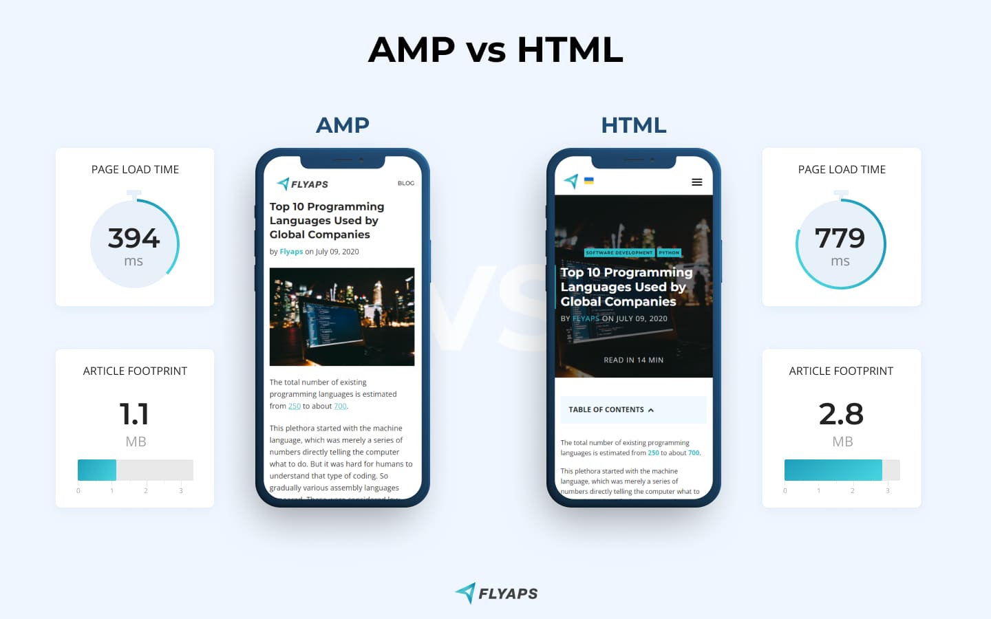
The advantage of an AMP page version is that it loads notably faster. We compared the load time of our long read article Top 10 Programming Languages Used by Global Companies with many heavy images and got a 97.7% increase in page load time - 394 ms against 779 ms. Also, the article footprint of an AMP version was 254% smaller compared to HTML - 1.1 MB vs 2.8 MB.
Accelerated mobile pages (AMP) were introduced by Google in 2015. They are a fast way of transmitting content to web users who are utilizing mobile devices. It is the most popular technology for mobile pages. People are often most impatient on their smartphones, so speed on mobile matters more than anywhere else.
Usage of accelerated mobile pages skyrocketed in the last years of the 2010’s. It has since plateaued, but will likely continue to be an important trend for years to come.
One advantage of accelerated mobile pages is that Google’s search engine algorithm prioritizes them. Google prefers pages that load quickly. Additionally, online advertisements load faster on AMP pages, making them ideal for advertisers.
To enable AMP on your webpage you need to implement AMP markup which is a subset of an HTML. Also, many CMS support AMP by generating it from the HTML version. If you are reading this article on a mobile device, you are probably seeing the AMP version.
Note: not every web page could be easily converted to the AMP markup. AMP works perfectly for static content. If you have a dynamic web page with sophisticated behavior, it might be impossible or very expensive to produce an AMP version.
Also, you might experience problems with third-party plugins on your page. Additionally, if you confess SPA methodology in web development then AMP will not be available for you freely — server-side rendering or page pre-render should be considered.
Conclusion
The world of web apps changes rapidly, and 2022 is no exception. Trends from recent years will continue to make an impact, and new technologies will become commonplace as well. Consumers will continue to demand faster, more lightweight web experiences that they can enjoy with their phones on the go.
One theme that web developers should keep in mind is to design applications that cater to smartphone users. Progressive web apps, Mobile-first development, and Accelerated mobile pages all do this.
Another theme is developing strategies that maximize the flexibility and potential of applications. This includes API-first development and Micro frontends. Both practices let developers make incremental changes to their applications over short periods of time.
Lastly, consumers are changing the way that they physically interact with computers. Dark-mode applications are popular because of the expectation of staring at a screen for long periods of time. And IoT applications are expanding the domain of software possibilities by embodying the internet in every physical form imaginable.
At Flyaps, we pay close attention to the latest trends in web app development. This helps us deliver the best products we can to our clients, ensuring speed, security and reliability.